The Power of Red
Red is one of the most immediate and physically felt colors in the visual spectrum. Operating at the longest visible wavelength, it carries a perceptual urgency that reaches the eye quickly and registers emotionally before the brain has time to analyze it. In both art and interior environments, red rarely functions as background. Instead, it establishes presence, intention, and emotional gravity without relying on ornament or excess visual complexity. In contemporary interiors, a single red artwork can ground neutral palettes, activate minimalist architecture, and introduce contrast within darker tonal spaces, creating movement while maintaining visual authority.
The Cultural Impact of Red
Culturally, red carries layered meaning across the world. In Western contexts it is linked to love, power, and visibility. In China it symbolizes prosperity, celebration, and good fortune. In Middle Eastern and Mediterranean traditions it has represented protection and life force, while in India it is deeply tied to marriage, fertility, and sacred energy. Across many African cultures, red is associated with life, sacrifice, transformation, and spiritual transition. Within contemporary fine art, red moves far beyond decoration. It operates as structure, atmosphere, memory, and symbolic language, allowing artists to use it as architectural force, emotional field, or psychological signal depending on context.
The Emotional Impact of Red
Across contemporary painting, red appears through multiple visual languages, from geometric structure and figurative emotional anchors to layered abstraction and material-driven surface. Biologically tied to blood, warmth, and vitality, red has long been associated with attraction, urgency, confidence, and power. Research suggesting red can elevate heart rate and stimulate appetite helps explain its consistent presence in dining and hospitality environments, while in residential spaces it offsets overly cool palettes and adds emotional depth. For collectors, red works often become defining pieces within a collection, maintaining visual strength across scale, distance, and changing light conditions.
Red in Contemporary Art

Tricia Strickfaden’s Some Like It Hot operates at the intersection of architecture and rhythm. Interlocking shapes and angular planes create a structured visual cadence, while subtle transitions between transparency and opacity introduce depth and spatial movement. The composition balances precision with intuitive gesture, allowing the painting to feel both engineered and alive. In this work, red functions as spatial structure rather than emotional accent. The surrounding orange, cream, and black tones allow red to advance and recede, creating visual push and pull that activates the viewer’s eye. In interior environments, works like this align naturally with contemporary architecture, stone surfaces, glass, and metal finishes while still introducing warmth.

Aric Ben Simon’s N° 18-2G.25 approaches red through material process and tension. The work begins with burned wood inspired by yakisugi technique. Fire leaves behind cracks and fissures that record time, heat, and force before geometric order is introduced. Muted yellow and deep red forms establish measured rhythm while allowing the charred surface to remain dominant. The work reflects postwar material abstraction, where damage becomes part of meaning. Red here stabilizes rather than dominates, grounding the composition against dark material history. In interiors, this type of work adds emotional weight and tactile depth, particularly within modern architectural settings.

Justin Price’s Disintegrate My Blue Skies shifts red into psychological narrative. Figurative realism dissolves into layered abstraction, allowing figures to merge into the environment. Burgundy, blue, and slate tones interact with flashes of neon magenta and yellow, creating emotional tension. Red operates as a narrative anchor, grounding instability while allowing transformation to unfold. In interior settings, works like this introduce storytelling and emotional layering, rewarding both distance viewing and close engagement.

Itaewon’s Arriving at Eternal Love explores red through movement and spatial layering. Intersecting planes sweep across the surface in overlapping trajectories. Deep reds, blush tones, amber, and translucent gold create a composition that feels both architectural and atmospheric. Light appears to pass through layered planes, giving the work internal luminosity. Red becomes kinetic rather than static. It moves the viewer through space instead of holding them in one location. In design environments with strong natural light, these works shift throughout the day, creating an evolving visual experience.

In La Coquette, Haleh Mashian explores identity and transformation through material surface. Torn and reconstructed canvas creates dialogue between painting and relief. Acrylic layered over textile and wood dissolves the boundary between two and three dimensions. Fragmented planes create both containment and rupture, positioning the figure as a symbol of self-definition. Red functions as emotional grounding while supporting the physicality of surface. In interiors, dimensional works like this interact with light in ways flat paintings cannot, creating subtle shadow shifts across time.

RETNA’s Love Letter transforms written language into visual rhythm. Calligraphic systems become dense emotional fields rather than readable text. Crimson enamel and crystalline surface texture preserve physical gesture and performance. Red becomes communicative energy rather than symbolic image. The unreadable script removes hierarchy and allows viewers to experience the work through sensation rather than language. In architectural spaces, large calligraphic red works act as cultural and emotional anchors.

Mashian’s Mona Hissa moves red into psychological portraiture. The figure emerges from dark greens and black tonal fields while a red garment creates emotional center. Sculptural impasto builds shifting light across the surface. Red here acts as emotional core rather than surface accent. The painting exists between portrait and symbolic presence, inviting personal interpretation. In layered interior environments, works like this create strong emotional grounding.

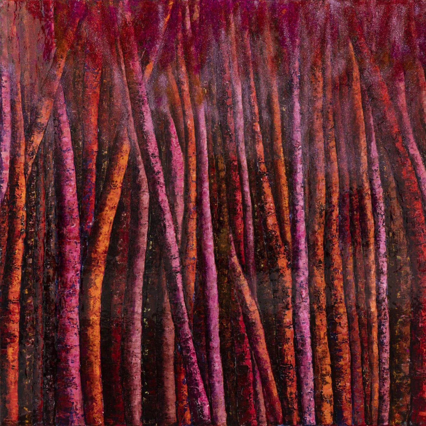
Moulin Rouge by Haleh Mashian translates red into environmental atmosphere. Forest imagery dissolves into abstraction through saturated crimson, magenta, and orange tonal layering. Vertical rhythms create structure while maintaining organic movement. Red becomes immersive environment rather than focal detail. In large collector spaces and hospitality environments, works like this operate as spatial experiences rather than decorative elements.

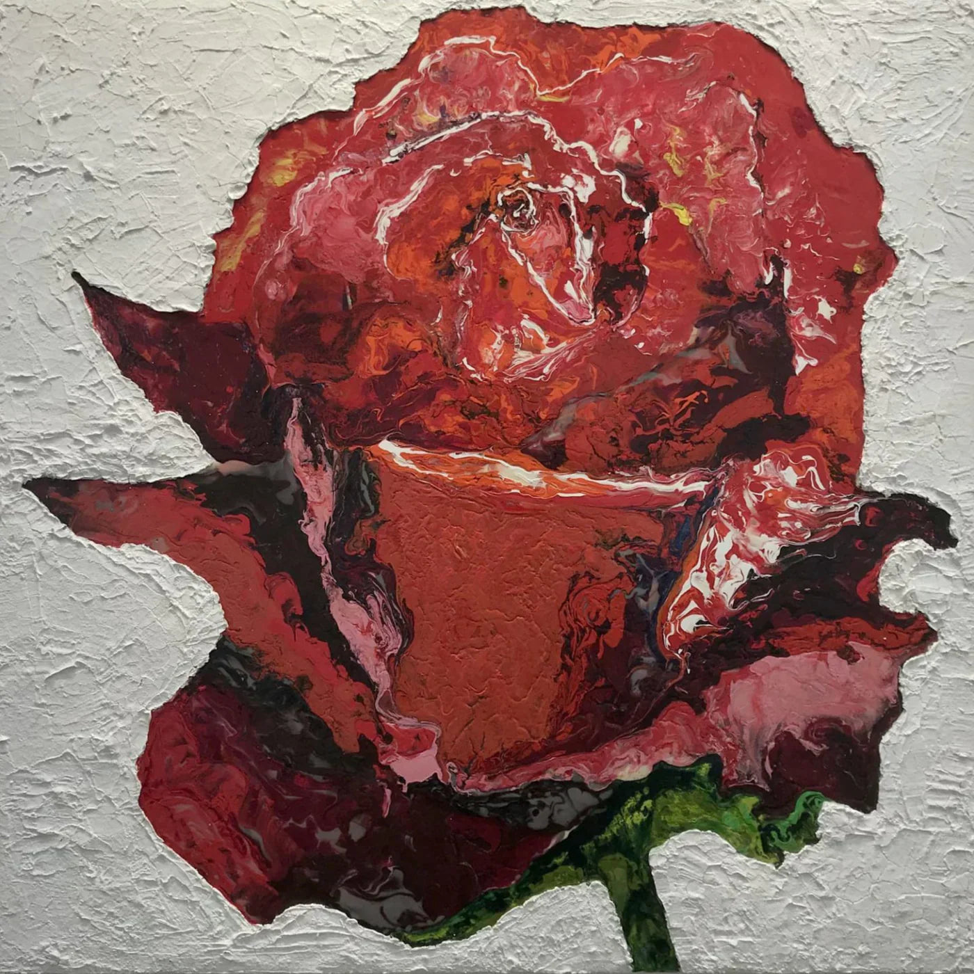
Mashian's Red Rose returns red to archetypal symbolism. Crimson, scarlet, and maroon layered through sculptural mixed media create dimensional emotional weight. Jagged petal edges introduce tension, replacing traditional softness with material force. The rose becomes both beauty and vulnerability. In interiors, contemporary floral works with dimensional surfaces introduce familiarity while still maintaining strong collector presence.

Gina Palmerin’s Rite of Passage moves red into ritual and collective feminine narrative. Symbolic imagery including fruit, floral forms, dove imagery, and architectural references to sacred space create layered storytelling. Red functions as ceremonial signal tied to continuity and transformation. In collector environments, narrative works like this add cultural and emotional storytelling dimension.

Tina Bluefield’s Heart Waves translates red into frequency and pulse. Undulating vertical lines create optical vibration across shifting red gradients. Small contrasting color interruptions reinforce visual rhythm. The work behaves as living surface, expanding and contracting visually with viewer movement. Red becomes sensation rather than symbol. In modern architectural spaces, works like this activate entire rooms through visual energy.

Michael Baker’s Untitled L27 brings red into restraint and quiet material presence. Layered textile construction creates contemplative color field atmosphere. Soft tonal transitions interact with fabric surface, producing tactile visual experience. Red shifts into emotional residue rather than direct signal. In interiors designed around material richness and subtle lighting, works like this create calm and grounding presence.
Red artwork continues to perform strongly across both residential and commercial environments because it holds visual authority without overwhelming surrounding design. It maintains clarity in digital presentation, carries presence in large architectural spaces, and translates across cultural audiences. For collectors, red works often become central emotional anchors within a broader collection narrative.
Ultimately, red is never passive. It demands presence. It carries emotional clarity and physical energy. In interiors, it introduces life and movement. In art, it carries memory, identity, and symbolic weight. The strength of red lies in its ability to exist simultaneously as structure, emotion, and symbol. Whether expressed through abstraction, figuration, or material surface, red continues to shape how we experience both art and space.