How to Use Vibrant Colors in Interior Design
Vibrant vs. muted palettes, where they belong, and what they bring to a space
Color is one of the most powerful design tools in an interior. It shapes mood, movement, and how a room is experienced over time. The key is not choosing between vibrant or muted colors, but understanding when, where, and how each works best.

Vibrant Colors: Energy, Focus, and Momentum
Vibrant colors introduce energy and direction. They bring immediacy to a space and naturally draw the eye. Used thoughtfully, they act as visual anchors rather than noise.
What vibrant colors bring
• A sense of movement and confidence
• Clear focal points within a room
• Emotional lift and creative stimulation
Best placements
• Statement art on neutral walls
• Accent furniture or sculptural lighting
• Entryways, dining rooms, and social areas
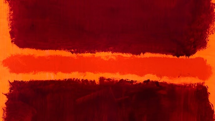
Vibrant color works best when it has room to breathe. A single strong artwork, a saturated chair, or a bold rug can define the personality of an entire space without overwhelming it.

Muted and Soft Tones: Balance, Depth, and Longevity
Muted colors create stability. They allow the eye to rest and give interiors a timeless quality. These tones often reveal their depth slowly, which makes them ideal for spaces meant for relaxation and long-term living.
What muted colors bring
• Calm and visual continuity
• Flexibility as collections evolve
• A strong foundation for art and texture
Best placements
• Bedrooms and private living areas
• Large wall surfaces and flooring
• Spaces meant for focus or rest
Muted palettes do not mean flat or boring. Texture, material variation, and layered neutrals add richness without visual overload.

Vibrant vs. Muted: It’s About Relationship
The most successful interiors rely on contrast. Vibrant elements need quiet surroundings to stand out. Muted spaces gain character when energized by intentional color moments.
Think of muted tones as the structure and vibrant color as the punctuation.
A neutral room with one confident artwork often feels more intentional than a fully saturated space. Likewise, a colorful room grounded with soft walls and natural materials feels balanced rather than chaotic.
How Art Bridges the Two
Art is often the safest and most impactful way to introduce vibrant color. It allows flexibility. Art can be moved, rotated, or replaced as a space evolves.
In interiors designed for collectors or designers, vibrant artwork:
• Creates emotional connection
• Sets the tone without permanent commitment
• Becomes the conversation point of the room
Vibrant color brings life. Muted color brings grounding. When used together with intention, they create interiors that feel dynamic, thoughtful, and deeply personal.
The goal is not to choose sides. It is to choreograph how color moves through a space and how it supports the way people live within it.
Texture, Muted Color, and Vibrant Color in Interior Design and Art Collecting
In contemporary art and interior design, texture plays a central role in how color is perceived, experienced, and remembered. For art collectors and interior designers, understanding the relationship between texture, muted color, and vibrant color is essential when selecting artwork that will define a space over time.
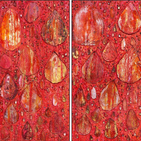
In artworks with vibrant color, textured surfaces intensify visual impact by adding physical depth and density. Layered paint, dimensional materials, and surface variation give saturated hues greater presence, allowing bold color to feel grounded rather than overpowering. In interior spaces, vibrant textured artwork often functions as a focal point, anchoring a room and providing structure within minimalist or architectural environments. These works are particularly effective in contemporary interiors, hospitality spaces, and curated private collections where art must hold visual authority.

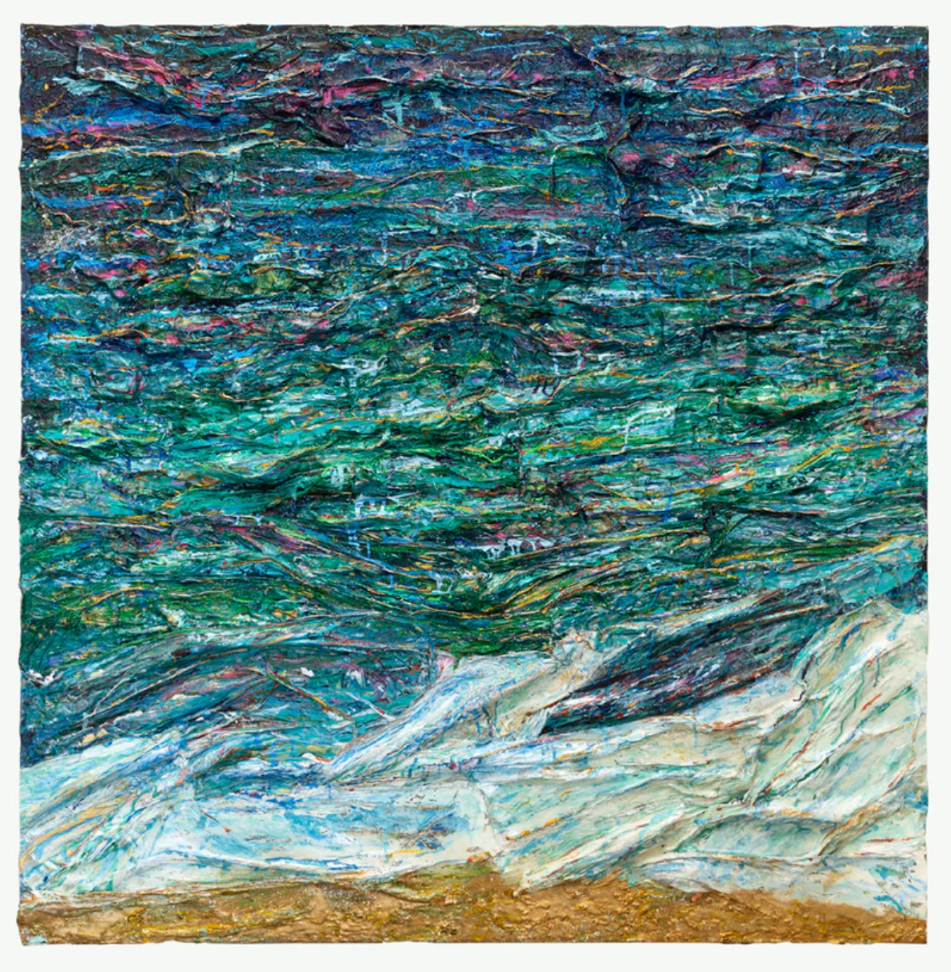
Muted color palettes rely on texture in a different way. When color is restrained, surface variation becomes the primary source of movement and complexity. Textured muted artwork introduces subtle tonal shifts that respond to light throughout the day, creating depth without visual excess. For interior designers, these works are ideal for spaces intended to feel calm, cohesive, and timeless. For collectors, muted textured art offers longevity, supporting environments that evolve without losing balance.

Psychologically, texture influences how art is felt within a space. Textured vibrant artwork activates energy and attention, encouraging engagement and emotional response. Textured muted artwork promotes stability and focus, contributing to a sense of order and comfort. In both cases, texture bridges visual impact and emotional resonance, making art feel physically present even without touch.
For art collectors, interior designers, and art advisors, texture is not a secondary detail. It is a defining factor in how artwork integrates with architecture, light, and human experience. When thoughtfully chosen, textured art becomes more than a visual element. It becomes a structural and psychological anchor within an interior.