Article: Warm Colors in Art: Why I've Always Painted from the Inside Out
Warm Colors in Art: Why I've Always Painted from the Inside Out
I did not choose warm color. It chose me.
I have been asked, more times than I can count, why my paintings are so warm.
It is a fair question. Walk through my studio and you are walking through heat. Reds that feel abundant and alive. Golds that glow from within. Roses that refuse to be delicate. Even my blues tend to carry warmth somewhere underneath them — a buried amber, a shadow that leans toward copper rather than gray.
I used to give the practical answer. Color theory. Complementary tension. The way warm colors in art advance toward the viewer and command presence. All of that is true. But it is not the real answer.
The real answer is that warmth is simply my native language in paint.

Where Warm Color Comes From
There are things you carry without knowing. The light of the place you grew up — warm, golden, abundant — becomes part of how you see before it becomes something you can name. When I started painting, I found myself reaching for warm colors instinctively. Not as a reference to where I came from, but as the most natural visual language I had. Color settles somewhere beneath thought and comes out in the work before you have made any conscious decision at all.

Why I Always Return to Warmth
I do not reach for warm color because I have decided to. I reach for it because it is the most natural thing in the world to me — the way some people automatically turn toward sunlight when they walk into a room. It is not a choice so much as an orientation.
When I stand in front of a blank canvas, warmth is where I begin. Even when a piece moves toward cool tones eventually, I usually start from heat and work outward. It is my home base. My default language.
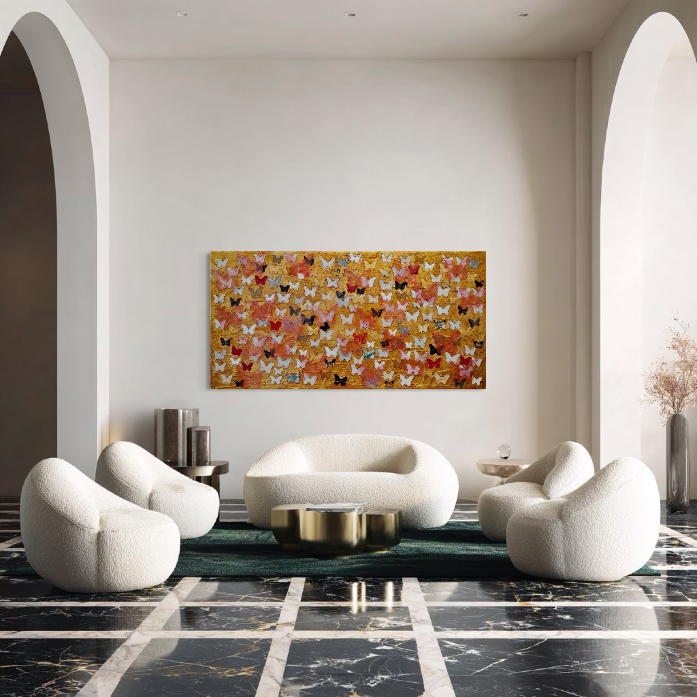
And within that world of warm colors, red is where I feel most at ease.
I know that surprises people. Red is the color most painters and designers treat with caution — the one that dominates, they say, that needs to be handled carefully and used sparingly. I experience it completely differently.
To me, red is a neutral.
Not neutral in the sense of being quiet. But neutral in the sense of being endlessly versatile — a color that holds its own presence while lifting everything around it. Red pairs with gold and becomes regal. It pairs with deep green and becomes alive. With black it gains gravity. With white it breathes. With pink it becomes tender. With rust and terracotta it disappears into the earth in the best possible way.
Red does not erase its neighbors. It harmonizes with them. It accentuates without overpowering. It has a generosity to it that I find rare in color — a willingness to be in relationship while never losing itself.
That is what I mean when I say red is my neutral. It is the color I trust completely.

What Warm Colors in Art Actually Do to a Space
Warm color invites. That is the simplest way I can say it.
I have watched people walk into rooms where my work hangs. There is a moment — brief, almost unconscious — where something in them shifts. Their shoulders drop slightly. They slow down. They stop scanning and start looking. They feel, without being told, that they are welcome here.
That is warmth working. Not on the eyes, but on the body. On the part of us that decides, before the mind catches up, whether a space is safe or not. Whether we can stay.
This is why warm art for home works so differently from cool or neutral work. It does not ask you to appreciate it from a distance. It pulls you in. Cool color asks you to observe. Warm color draws you closer — the one that says: come in, stay longer, let something land.
In my own home, I cannot live without warmth on the walls. Not because I am afraid of cool color, but because I need to come home to something that feels like arrival. Like the light is on and someone is expecting me.
That is what warm art for home does at its best. It does not just hang there. It welcomes.

How I Build Warmth in My Own Work
My Rose Series is where I first understood warm colors in art as something layered rather than applied.
Early in that series, I was working with warm color the way a lot of painters do — choosing warm pigments and putting them on the canvas. The results were fine. They were warm. But they were not alive.
What changed it was learning to build warmth from underneath. To start with something darker, cooler, more complicated, and let the heat emerge through layers. A rose is not one pink. It is dozens of decisions — where shadow lives, where light bends, where a petal holds color differently than the petal beneath it. Working through that taught me that warmth in painting, like warmth in a person, is not a surface quality. It is something built.
The Tree Series took that further. A tree in winter does not look warm. But a tree painted with warm undertones — with ochre pressing through gray bark, with amber in the negative space between branches — becomes something that holds feeling rather than just describing form. That is the distinction I am always working toward.
Choosing Warm Art for Your Home
People ask me sometimes how to live with warm painting — how much is too much, where it belongs in a room, whether it overwhelms.
My honest answer: trust what the space needs, not what the rules say.
I have seen small rooms transformed by a large, warm canvas because the painting gave the room its reason for existing. I have seen sprawling, beautiful homes that felt cold and anxious because everything on the walls was carefully, safely neutral. Warm art for home is not about quantity. It is about whether the work is actually generating something — heat, feeling, a quality of presence — or just filling space.
The pieces that stay with people longest are the ones where you feel the temperature shift slightly as you walk toward them. Where something in you responds before your mind catches up. That is the signal. That is what I am always chasing when I work.

Why Warm Colors Will Always Be My Starting Point
I am not a painter of warm color because I lack range. I work in blue. I work in near-black. I work in the gray-green of water on a cloudy afternoon.
But I keep returning to warmth because it is the most honest thing I know how to make — color as a language that does not require translation, that speaks before it explains.
When I finish a painting and it is warm — genuinely warm, not just orange — I feel like I have said something true. Not something explained. Something felt.
That is enough. That is everything.
